Johnson & Johnson
Digital Transformation of a legacy DAM platform to reduce friction and streamline workflows.
Role: Lead UX Designer
Scope: Wireframing, user flows, taxonomy
BACKGROUND
I was contracted for a 4-week engagement to redesign the Digital Asset Management (DAM) system for Johnson & Johnson, used by internal marketing teams and external agency partners to upload, tag, and retrieve regulated medical documents.
The system supported high volumes of medical content across multiple stakeholders and required a more structured, scalable experience to improve efficiency and usability.
PROBLEM
The existing DAM system was not built for high-volume medical document tagging. This made it difficult for users to efficiently upload, tag, and retrieve regulated content across teams.
Users struggled with:
-
Complex and unclear tagging workflows, especially for multi-page medical documents
-
No support for bulk tagging, resulting in repetitive manual effort
-
Inconsistent tagging structure and naming conventions, making it difficult to locate or reuse documents reliably
-
Limited separation between user and admin functionality, causing confusion around permissions and controls
-
Lack of clear workflow structure across upload, tagging, and retrieval, leading to slow and error-prone content management
SOLUTION
As the sole UX designer on a 4-week contract, I led the redesign of the DAM system, focusing directly on removing friction from high-volume medical document tagging and retrieval.
The goal was to simplify core workflows, standardise structure, and make the system usable at scale across different user types.
This was achieved through..
1. Mapping real user workflows end-to-end
Mapped 10 core flows across CLM (internal marketing teams) and JPro (external medical professionals) to surface breakdowns in upload, tagging, and retrieval before redesigning any screens.


2. Simplifying upload and tagging workflows
Redesigned the upload flow to support multi-page document handling and introduced clearer step-by-step tagging, reducing ambiguity when assigning tags across large medical files and improving consistency in how documents were processed.
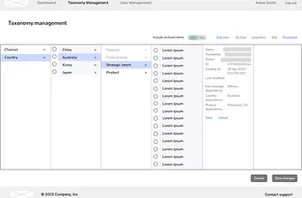
3. Building a taxonomy and separating admin controls
Rebuilt the tagging taxonomy into a more consistent hierarchy to reduce variation in how documents were labelled, and clearly separated admin-only controls (e.g. access permissions, restricted fields) from user-facing tagging actions to reduce confusion during use.
IMPACT
Improved workflow efficiency across tagging and retrieval
Reduced friction in core workflows, enabling internal / external partners to manage high volumes of medical content more efficiently.
Positive stakeholder alignment and approval for build
Redesigned flows and wireframes were validated by stakeholders and successfully handed off to engineering and UI teams for implementation.
Foundation built
for scalable DAM system
The redesigned structure established a scalable foundation for future expansion of the system across additional workflows and user groups.
KEY TAKEAWAYS
Designing for complex systems means designing for tradeoffs, not ideal flows
In enterprise DAM systems, user needs, compliance constraints, and business rules rarely align. The most effective solutions came from explicitly designing around constraints rather than trying to eliminate them.
Workflow mapping is where most of the real UX problems are found
The biggest usability issues were not visual, but structural. Mapping end-to-end flows early exposed breakdowns across upload, tagging, and retrieval that would not have surfaced in isolated screen design.
Separation of concerns is critical in admin-heavy systems
Clarity between user actions and admin controls significantly reduced cognitive load. In complex systems, reducing ambiguity often matters more than reducing steps.