Ozempic
Designed a patient-facing portal experience to improve medication tracking and adherence for Ozempic users.
Role: UX Designer
Timeline: 3 months
BACKGROUND
A patient portal experience designed for Ozempic users to support medication tracking, dosage adherence, and ongoing treatment engagement.
The platform aimed to help patients better manage their treatment journey through clearer guidance, reminders, and access to relevant health information, while supporting clinicians with more structured patient engagement data.
PROBLEM
The existing patient portal lacked structure across key stages of the treatment journey, making it difficult for patients to confidently onboard, manage medication, and communicate with medical teams.
-
Patients were not properly guided through setup or how to use the portal, leading to low initial engagement and confusion around core features.
-
There was no structured way for patients to follow or understand their dosage schedule within the app, making it harder to stay consistent with treatment.
-
Patients had no easy in-app method to ask questions or raise concerns, forcing reliance on external channels and reducing continuity of care.
SOLUTION
Overall, the redesign focused on improving patient–doctor communication and making treatment management more structured and accessible within the app.
This was achieved through..
1. Improving the onboarding experience
Redesigned onboarding to better guide patients through setup, ensuring they understood how to use the portal, what information was available, and how it supported their treatment journey.

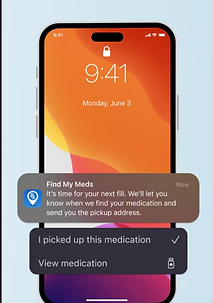
2. Doctor-led medication scheduling with patient reminders
Introduced a structured flow where doctors input personalised medication schedules, which then automatically generated clear reminders for patients to support adherence and reduce missed doses.
3. In-app medical enquiries
Enabled patients to submit questions and concerns directly through the app, creating a more continuous communication channel between patients and the medical team outside of scheduled appointments.

IMPACT
Improved trust between patients and healthcare teams
Structured and continuous communication helped patients feel more confident in their treatment journey.
Better treatment adherence through clearer structure
Doctor-led medication scheduling combined with timely reminders improved medication consistency.
More connected end-to-end care experience
Bridged onboarding, treatment and communication into a single system, supporting a seamless patient experience.
KEY TAKEAWAYS
Good healthcare UX connects journeys, not just screens
Onboarding, treatment management, and communication only worked effectively when designed as one continuous care experience rather than separate features.
Client communication is part of the design process
How work is framed, presented, and iterated with stakeholders directly influences alignment and outcomes, especially in regulated or clinical contexts.
Designing under constraints sharpens decision-making
Time pressure, compliance requirements, and technical limitations force clearer prioritisation and more intentional design trade-offs.